Sunday, October 25, 2015

Development of a Field Navigation Map and Learning Distance/Bearing Navigation

Introduction
Before the advent of modern geospatial technology, geographers used a wide range of methods to find their path and direction. Some of the earliest methods involved navigation by the stars in the sky(Figure 1.) or by the angle of the sun's rays. In this exercise we used another ancient method to determine angle and distance, pacing.
Figure 1. Example of navigation by stars and lunar position. Image by Tim Woods.

The Romans used a pacing method when marching through uncharted territory. Mile is formed from the root word 'mili' meaning 'thousand.' Mille passuum translated to 'one thousand paces' and was one of the first established units of long distance measurement. (Scotland Mountaineering Council)

From the distance data collected we can create maps that will aid us in Navigation at The Priory in the subsequent exercise.

Methods
For the start of this exercise we needed to measure our own walking pace as measured on a known distance. We determined two points with a 100 meter distance between them and walked using our normal walking pace to the end.(Figure 2.) We repeated the measurement on the way back and compared the results. I found that for every 100 meters I walk about 65 paces. Paces were defined as every time my right foot hit the pavement. In the subsequent navigation exercise I can determine that for every 100 meters I need to travel I will have to walk about 65 paces.
Figure 2. Measurement area for pacing. Just past the grey van is 100 meters.
We will use this measurement on the maps that we created for the subsequent navigation activity at The Priory, a multiple use UWEC facility.(Figure 3.)We constructed two maps to be used, one that utilizes a UTM grid with 50 meter spacing and one that provided Geographic Coordinates in Decimal Degrees.
Figure 3. Locator Map of The Priory in relation to the main UWEC campus.
In order to create our maps we utilized existing aerial satellite images, elevation data, and area boundaries from the general Geospatial Data folder. These features will help us distinguish minor changes in the vegetative cover and topography of the area when we perform the navigation activity. although sometimes helpful, a satellite image is not a good primary tool for navigation because vegetation changes seasonally and it is difficult to discern much detail from an aerial image on the ground. Elevation is a useful feature to some extent as it gives you an idea of what the ground topology should look like. I used a 5 foot elevation spacing because it looked to me to show an adequate amount of feature change while not cluttering up the map. Large changes in ground elevation can be useful for navigation because it gives us features to look for such as slopes or hills, but it can also hinder our navigation as it is difficult to perform standard walking paces up and down the area.

The most important aspect of our maps was projecting the right data and having known measurements and scales from which to begin our pacing. I opened the Layout View in ArcMap. I open up the data frame properties and clicked the grid tab. (Figure 4.)


Figure 4. Grid tab in the Data Frame Properties Window.

This gave me to option to create a new grid. All of the grids were set as Measured Grids because we wanted one that would divide the map into standard measured units. From the windows that result I could adjust the properties such as font, color, significant digits, and appropriate spacing. This also where I set the coordinate system for each map.  This part was the most difficult because it required both playing around with the features and then fine adjustment. I found that subjectivity was also involved. What I found to be a pleasing color and spacing may have seemed aesthetically unpleasing to another. The final step was to adjust the other features on the map such as scale bar, north arrow, title, legend, watermark and helpful data. Being able to compare the final UTM map (Figure 5). and the GCS Decimal Degree map (Figure 6.)will be helpful during the navigation exercise.
Figure 5. Final UTM map created for the navigation activity.
 
 
Figure 6. Final Decimal Degree map created for the navigation activity.

Discussion
Pace counting for distance measurement is a useful tool as it requires no equipment other than one's self. However, ground hazards such as brush, steep elevation changes and impassable areas might be a hindrance that newer technology will be able to overcome. Another issue is that there can be variation in paces for a variety of reasons including fatigue, miscounting, over or undercompensating, and needing to sidestep to avoid hazards. Regardless, I predict that this method will be beneficial to have in my repertoire in case of technology failure.

I am slightly apprehensive using the maps in the field. Although I often use maps for reference I tend to rely on landmarks instead of pacing to achieve distance measurements and orientation. It will be an interesting exercise and I hope to solidify my confidence in using this method. I believe comparing the two maps and using my team's combined skills will help me develop confidence in my own navigation skills.

Conclusion
It is vital to have multiple navigation methods available for use because one never knows what situation they will be presented. Knowing how to create a map for navigation use is also vital because not every area has the correct area or data for your use. It is useful to learn these things and these skills with be utilized in our future careers as geographers.

Sources
The Mountaineering Council of Scotland
The Greatest Idea Campaign Ever Run, Tim Woods
UWEC Resident Halls

Sunday, October 18, 2015

Unmaned Aerial Systems


Introduction
The purpose of this exercise was to experience a UAS, an Unmanned Aerial System. We were exposed to various UAVs (Unmanned Aerial Vehicles) and were lectured on their platform attributes along with their strengths and weaknesses in various situations. When choosing the proper UAV, a lot depends on the project at hand and it's constraints, be they flight time, stability, takeoff distance, ect.
This exercise contained three components. The first was a viewing of various vehicles and their attributes, a short lecture by Prof. Hupy about applying the right vehicle to the projects, and a flight demonstration on the Chippewa River floodplain. We flew the DJI Phantom and gathered aerial imagery of features on the floodplain. The second component of the exercise was taking the data collected from the DJI and creating a high pixel image interpretation using a point cloud with Pix4D software. This component focused on UAS related software so we also explored creating a flight plan with Mission Planner Software, and tested out our own UAS driving skills with Real Flight Simulator. The third component of the exercise was to apply our knowledge of UAS and select the most appropriate vehicle for a given scenario.


Methods

Part 1: Demonstration Flight
One of the most important aspects of UAS is having enough knowledge of UAV attributes in order to make the most efficient and cost-effective selection. Aerial systems can range from helicopters and drones, to fixed wings airplanes, and to kites, balloons, and satellites. For this exercise we focused on multirotor and fixed wing aircraft.

The first UAV we saw was a fixed wing aircraft composed mostly of styrofoam. (Figure 1.)The components included the "brains" of the craft; Pixahawk-3D robotics. This system was the flight control of the craft. The modem incorporated into the craft communicated with a computer on the ground or at a base station. It allows the craft to essentially fly itself, which differentiates it from RC or 'remote controlled' craft which are controlled by someone on the ground. Another component of the fixed wing was the antenna which served as a receiver, a battery which powered the craft, and a hook which is used with a bungee launcher to propel the craft to a high enough initial velocity to achieve flight. After the launch, the internal mechanisms take control over maintaining flight. Many UAVs can be outfitted with additional components in order to achieve the goals of the flight mission. This fixed wing aircraft contained a POM, or Personal Ozone Monitor. This device can be used to detect ozone levels a various altitudes and locations and attaches a GPS location with the data, which environmental scientists can map and analyze.
Figure 1. Internal mechanisms of styrofoam fixed wing aircraft. Note the antenna, modem, Personal Ozone Monitor and other flight components.
An advantage of this UAV is its long flight time of 1.5 hours. A longer flight time means more time to collect data for analysis. Another advantage is that a fixed wing provides for a stable flight due to its internal mechanisms and broad wings. (Figure 2.)This prevents data skewing due to craft pitch, haw, or roll. A disadvantage of this system is that it's batteries do not provide a lot of energy output as related to their weight which means that a large portion of energy is required to accommodate for the weight of the battery. Another issue is that the batteries are highly volatile and have been known to combust spectacularly when overheated. This of course provides a dangerous component, not only to the system itself, but also for bystanders and flammable study areas.
Figure 2. Broad wing of the fixed wing aircraft. The wings were detached for storage and transportation purposes.
The next UAV we observed was a Multirotor Quad Helicopter. (Figure 3.) The "quad" describes the four rotors. The rotors spin in opposite directions which is beneficial to efficient upward force. With the four wings an operator can control the rate of speed and how the craft steers.
Figure 3. Multirotor Quad Helicopter
A benefit of this craft is that it can be launched straight up which is beneficial in places with not a lot of launch space such as the deck of a boat. Another benefit is that because each rotor can be controlled independently, it is more agile than the fixed wing aircraft. A disadvantage is that like the fixed wing, there is not a lot of payload for the energy input required. More torque is needed, and is shown in the Multirotor with six total rotors (Figure 4.). This craft can handle wind better and has more energy output than the quad helicopter. Both of these crafts handle easier than the fixed wing, and can make tighter turns. However, both of thee crafts have a shorter flight time of less than ~35 minutes.
Figure 4. Multirotor Helicopter with 6 rotors.
After the UAV lecture we moved to the study area on the Chippewa River Floodplain. This area was chosen because it was relatively flat, had features we could easily map from an aerial view including rock features and the UWEC pedestrian bridge. It was also decently free of foot traffic and obstacles such as trees, buildings, and territorial birds of prey. Professor Hupy discussed the various safety methods and the startup procedure. (Figure 5) We then observed a flight and took aerial pictures using a stabilized camera. (Figure 6) I had the opportunity to fly the craft and found it not as easy as Professor Hupy made it seem. I am prone to crashing aircraft as shown in the subsequent flight simulator and was therefore hesitant to perform any drastic manuvers with the craft lest I cause a budget strain for the UWEC geography department.
Figure 5. Professor Hupy demonstrating proper safety and startup procedures.
 
Figure 6. Drone footage.

Part 2: Software
Another huge component of UAS is being able to convert the data into a usable format. For this we explored Pix4D, a software that uses cloud point mapping (Figure 7.) to convert images to maneuverable geographic data.(Figure 8.)
Figure 7. Feature shown using cloud point mapping.
Figure 8. Data imported into Pix4D for mapping
The processing took a long time so I went ahead and used the Real Flight Simulator in the other room for 45 minutes while the program ran in the lab. The first set of data was disrupted because although the progress bar said 100% completed, I didn't wait until I saw the success message (Figure 9.) and exported the file too soon which corrupted it and caused it to be useless.
Figure 9. Success message detailing the quality of the resulting feature.


I reran the process using only 12 images and found that the processing was much quicker. I then opened the resulting image in ArcMap and added background base mapping available from the previous lab. I found that the resulting map was very accurate and placed the image precisely where it occurred in the real world. (Figure 10.) (Figure 11.)

Figure 10. Ortho Map. Location of the resulting feature exactly where it occurs in the physical world.

Figure 11. DSM Map. Note that the river level changes but the feature is accurately displayed.


Another software we used was Flight Plan Mission Planner.(Figure 12.) This software allowed us to plan out theoretical missions and tweak factors to our imaginary constrictions such as flight time, altitude, and the amount of images we wanted to capture. I was surprised when tinkering with it to learn how many features were codependent on others. At some times these dependency's seemed almost counterintuitive until I reasoned through it. I explored and manipulated the effect of altitude, (Figure 13.) speed of the UAV (Figure 14.) and angle (15.)

Figure 12. Default values of Mission Planner software.


Figure 13. Manipulation of altitude.
I found that as altitude increased, the total amount of passes decreased. This is because more of the area will be included in the frame of the camera lens so fewer passes are needed. However, fewer images at a higher altitude will increase the level of distortion at the edges of each image. These distortions will need to be accounted for either in post processing or in additional flights.
Figure 14. Manipulation of the UAV speed.
The speed of the craft only had an effect on the total flight time of the project. It likely depends on camera speed but I would have thought that there would be a decrease in photo resolution or quality. Practicality issues that are not easily accounted for also arise such as what speed is physically capable for a particular UAV and potential danger to spectators and wildlife.
Figure 15. Manipulation of angle.
Angle was the final factor I manipulated. Because this project ran North to South, a change of angle only served to slow down the process as more time was spent flying over what wasn't included in the study area. This could be helpful in other project's whose orientation is not aligned with the cardinal directions.

In order to give us a better hands-on understanding of the differences between fixed wing and multirotor aircraft, we logged a half hour of flight time for each using Real Flight Simulator Software. This gave us the chance to 'play' with each platform and explore it's aspects without the danger of potentially costly damages and crashes.

The fixed wing system I simulated for 30 minutes was a Sea Plane model. (Figure 16.)
Figure 16. Sea Plane Scenario
I found that, as I expected, there was a major learning curve. My initial flight was decimated within fifteen seconds as I was feeling out how the controls worked. The next three or four flights ended the same way. However, after I discovered which controls did what, it became fairly intuitive although my total flight times remained short. I found that it was much easier to control the craft at high speeds, but if I made a mistake, it was much harder to correct. I found that the craft was fairly stable compared to the other simulations which I attribute to the broad wings and landing mechanisms. I admit that I chose the simulation and how I tried to land based off of an scene in the cartoon sitcom, Bob's Burgers. (Figure 17)

Towards the end of the simulation, I found I was able to successfully fly the craft upside down which was amusing but likely not practical in real world situations lest I become a stunt pilot. Overall I found the exercise very instructive and far less expensive than if I was to learn by myself. (Figure 18.)

Figure 18. End of the fixed wing aircraft simulation.
The second UAV I ran a simulation with was with a helicopter. (Figure 19.)
Figure 19. Beginning Helicopter simulation scenario.
I found this a far more difficult UAV to fly, perhaps because I could not have a 'chase' view and had to observe it from the ground, as one would do if they were actually controlling it. This made me less motion sick, but I found it much more difficult to determine my intended direction as compared to my actual direction and orientation. Start up was an issue because I struggled with the order of operation for flight. The pre-flight figure was helpful in determining the function of some of the controls. (Figure 20)
Figure 20. Startup controls that provide for a safe launch.
My flight times were far shorter because I resorted to simply 'hopping'; taking off and landing multiple times, slowly increasing my altitude until I felt mildly comfortable. I found the stability of the craft much harder to work with as very little steering caused the helicopter to veer off wildly. Steering was far less intuitive and there were very few soft landings. I found that durability was also a major issue as compared to the seaplane. I felt, rather resentfully towards the end of the simulation, that the helicopter would break if I simply looked at it wrong. (Figure 21.)
Figure 21. End of the Beginning Helicopter simulation.
Overall, I found the helicopter far less intuitive and much less forgiving to a novice operator. I enjoyed the stability and ease of operation of the sea plane, although the helicopter was faster and more precise in it's movements. I understand how each has its strengths and weaknesses as applied to a project.

Part 3. Scenario
A pineapple plantation has about 8000 acres, and they want you to give them an idea of where they have vegetation that is not healthy, as well as help them out with when might be a good time to harvest.

I would suggest implementing a plan using a lightweight fixed wing UAV. 8000 acres of cropland is a large area so a helicopter or quad copter would not be as efficient. Multirotors specialize in precision operations because they are agile and easy to steer over small areas to obtain precise details. Because of the broad nature of cropland, the long takeoff distance of a fixed wing UAV is not a negative factor.  A fixed wing UAV would be a good choice because it can fly for a longer period, on average 1.5 hours, it will have ample room to turn corners at the ends of the field, and the photos it will obtain will be taken in a more stable manner. I would suggest that the fixed wing UAV be outfitted with a camera that can collect an NDVI, or Normalized Difference Vegetation Index. This will help them see differences in crop health easier than with normal satellite photos and the images will have a higher resolution because the area is focused.

Conclusion:
This exercise was an important exposure to UAS and their platforms. Much of geography is trending towards the new possibilities that UAS offers and I believe that this technology will become increasingly relevant. It was exciting to control a UAV and participate in data collection. Data processing, which is often overlooked compared to the flashier 'drone' aspects, is also extremely important and I'm glad that I was able to process some data. It was also very useful to simulate both a fixed wing aircraft and helicopter in a way that causes no danger to anyone.

Sunday, October 4, 2015

Distance/Azimuth Survey Method


Introduction

This week we began lecture by discussing what can go wrong when surveying, including having your survey equipment detained by customs. In order to continue with the task, one has to have alternate measuring methods at their disposal. It's always a good idea to have multiple survey methods in case of failure or other issues. One of these methods is the distance-azimuth sampling technique. The purpose of this week's exercise was to create a map using this technique.

In order to create a map using the distance-azimuth technique we employed two pieces of equipment, the azimuth and a laser distance measuring tool. The azimuth, which is sometimes referred to as a bearing, is a compass-like device that measures degrees, from 0 to 360 . The laser distance measuring tool uses a laser device and distance finder to send and receive laser pulses in order to measure distance in meters. (Figure 1).


Figure 1. Laser device, distance finder, and azimuth compass tools used on this survey. This image was taken by past geography student Tonya Olson. 
Survey Area

The survey area for this lab was the UWEC campus mall. We chose this area because it contained many features including stone benches, trees, and light poles, all within a visible plain with minimal obstructions. There were other potential surveying points on the same plain which made this area an attractive subject. A high vantage point of the area obtained from the third floor of the Davies Center offered a clear panoramic view for data analysis (Figure 2.)
Figure 2. Panoramic view of the survey area; UWEC campus mall between the Davies Center and Schofield Hall.
Because of construction occurring on Schofield hall, a portion of the campus mall was omitted from the survey due to the inability to access the area (Figure 3).
Figure 3. The area of the campus mall that was ommitted from the survey due to construction occurring on Schofield hall. 


Methods

For this exercise we were split into groups of two. My partner and I decided to use the 'old school' method of azimuth compass, a laser device and distance finder. We chose this method because during the lecture time we had the good fortune to need to use this method while the rest of the class used the Tru Pulse laser, which are the tools previously listed combined into one piece of equipment. Luckily for us and unfortunately for the rest of the class, the Tru Pulse laser method was determined to be especially sensitive to EMI, or Electromagnetic Interference, emitting from underground power lines beneath the survey area. Wifi interference may have also affected the survey. Because of the concerns posed during this initial survey we were especially careful to keep all cell phones and metal that may affect the measurements away from the equipment during our actual survey.

Our data collection was done on a portable tablet in the field. Because we could collect directly in Excel, this prevented us from needing to reformat our measurements and perform tedious data entry. The latitude (x), longitude (y), distance (Meters), and azimuth (degrees) were collected along with a feature description (Figure 4).
Figure 4. Sample view of data collection table with columns for X, Y, distance, azimuth, and feature. Because all of the benches were surveyed first, that is the only visible feature in this view of the table.

A coordinate system was crucial because without one, the points are meaningless data that could occur anywhere on earth. Coordinate points 'tie down' a starting point from which to designate distance and bearing. Because we needed standard points from which to measure, we chose a single sidewalk crack in the center of a swirling sidewalk feature (Figure 5), a crack by a light pole, and the intersection of another swirling sidewalk feature.
Figure 5. Areas where the survey measurements were taken from.


Because the 'old school' method we used required two people, I held the receiver at chest height at each of the points. Because I wanted to keep the measurements consistent, I held the receiver at the back and center of each bench. This was made slightly physically difficult and socially awkward when the benches were occupied by scholars or individuals participating in courtship behavior. For trees and light poles the receiver was held at chest height in front of the feature. Dillian held the distance finder, the compass, and the tablet. He first looked through the azimuth using both eyes and measured the degree of the feature. Then, he pointed the distance finder at the receiver I held above at each feature points and read the laser output measurement for the distance, which he recorded (Figure 6).
Figure 6. Dillian using the compass and distance finder and then recording the data on a tablet. I am holding the receiver at each of the points in the back center of each bench (unshown).
We then switched positions when we chose the next standard points at the back at Schofield Hall and on the sidewalk swirls outside of Phillips Hall. I collected the data and Dillian held the receiver. In order to prevent skipped or doubly surveyed points, we used pink survey tape to mark the trees and light poles already recorded (Figure 7), and the benches that should be recorded when our standard point changed (Figure 8).
Figure 7. Survey tape marking a tree that whose bearing and distance was already collected. Note the expertly tied bow.

Figure 8. Survey tape marking benches that needed to be resurveyed because they were too far away from the initial point from which to collect data. Because the benches were arranged in simple concentric circles, it was only necessary to mark the features which were not collected. 

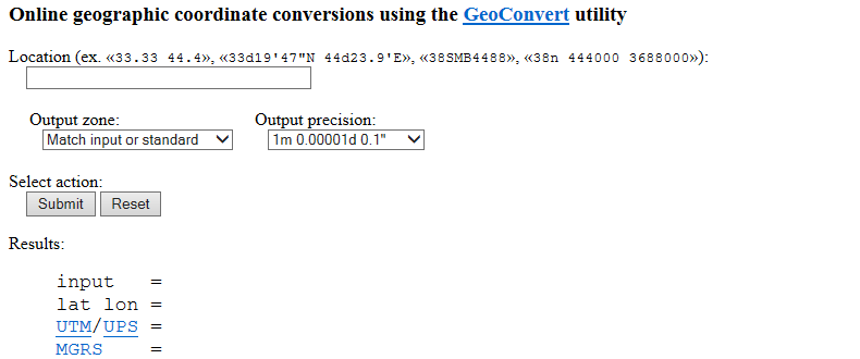
We also remembered to collect the coordinates of the standard points. We needed to convert the degree minute second form to the decimal form in order to input it into ArcMap. To do this we used a simple online converter tool (Figure 9). These numbers served as the X and Y for each of our points collected using that standard point. We used more than one standard point because not all features were easily visible or easily collected from one point.
Figure 9. Coordinate system converter.
 
After the measurements were collected, ArcMap was used to display the azimuth and distance data at the same time. First, the Bearing Distance to Line tool was used (Figure 10), matching the input data to the Excel data, the X to X (latitude), the Y to Y (longitude), the distance to distance(meters), the bearing field to azimuth field, and the object ID to the feature field (bench, tree, light pole). I then ran the tool and dragged the newly created feature onto the map (Figure 11.)\


Figure 10. The Bearing Distance To Line Tool. The bearing distance to line tool combines the bearing degree and distance to map data relative to a central point.

Figure 11. Map feature created from importing the data we collected. Unshown is the data collected from outside of the Phillips building because of scale issues. The feature was originally colored green but was later changed to red for visibility purposes. 

In order to validate that the points were in the correct spot I added a base map of the Eau Claire Campus collected from satellite data before 2014. At first I was confused why the data was appearing in a place I didn't recognize although I was sure that the coordinates were correct. I then realized that the base data I added was no longer relevant as it was imagery from before the campus reconstruction and my survey area was not showing up simply because it had not been constructed yet in the image (Figure 12).
Figure 12. The correct data as shown on an outdated base map, before the construction of the feature area. 

I then reimported a more recent map of the survey area and our collection point appeared to be in the correct place although the points were slightly off of where they were measured in the field. This image is also not completely up to date as some of the trees we measured have not yet been planted in this image (Figure 13).
Figure 13. The data displayed on the most recent map I could find. Note the construction still occurring in the top right corner.

We then needed to change our vertices to lines to more easily analyze the data. To do this I searched for the tool Feature Vertices To Points in the search bar. (Figure 14) It opened a window in which I specified my input data and output location. It gave me the options for 'point type' and selected 'ends' because I only wanted the ends to have a point. (Figure 15).

Figure 14. Feature Vertices to Points Tool
 
Figure 15. Feature Vertices To Line Tool window. Note how 'end' is selected for the point type.
I dragged the new point features onto my base mapping. This resulted in my final map. (Figure 16). Using this map it was far easier to analyze the accuracy of my data.

Figure 16. The final map with all of the points laid out. This format is a much easier way to analyze the data.


Discussion

Our 'back up plan' survey method could have used a back up plan. Unfortunately there were both intrinsic and extrinsic sources of error. The map does not display the correct points on the correct features even though the source point is in the correct place. This indicates that the alignment issues are not primarily caused by coordinate issues, but are more likely errors that occurred during collection. However, we also ran into coordinate system issues. We initially collected the latitude and longitude of our source point using the compass on our phones. Because our phones only displayed the coordinate to the second, all of the points resulted in the same coordinate. (Figure 17) In order to remedy this we used Google Earth to estimate the coordinate points which may have had slight variation depending on how we hovered the mouse over the point.
Figure 17. The compass reading given by all of the standard points. Because this compass was not accurate enough, all of the data would be shown emitting from a single point which would cause significantly more alignment issues. 
 

Other issues were the result of data collection. Although EMI was discussed after the failure of the Tru Pulse laser, it may have still occurred. I realized after the survey that because of the swirling sidewalk's dual function as a walkway and performance space during outside events, there is likely a large electrical outlet beneath the space with many wires passing under the area. It's possible that our compass's accuracy was compromised because of these unseen features.

We initially chose our method because of failure of the Tru Laser during the lecture period due to EMI. We wanted to avoid potential issues, but by electing to employ the 'old school' method we resigned ourselves to an already less accurate method. This method produced extra challenges collecting points that were far away. Not only is the accuracy of these distances decreased the farther away from the laser the point is, we also had significant difficulty in hitting the receiver with the laser enough to obtain a measurement. Because of this, some features such as far away trees and light poles were omitted from the final survey. 

Finally, human error may have played a significant role in the inaccuracy of our data. It is difficult to use the compass to determine bearing during even the most favorable conditions. The time of the survey and the angle of the sun made it very uncomfortable on the eyes to determine the bearing. We were unable to use sunglasses and still read the degree so we had to squint our way through data collection. My partner and I also had two major ocular differences that may have compromised the the accuracy of our data collection. I am left eye dominant and my partner is right eye dominant. This means that we each held the compass in a slightly different way and took slightly different measurements. The other ocular difference my partner and I had was that I believe Dillian to have strabismus amblyopia meaning that our eyes aren't aligned in the same way which would account for the accuracy differences between the areas each of us surveyed.

All of the issues may account for the inaccuracy of the final map. Unfortunately many of this issues cannot be solved without resurveying the entire project. I would have liked to have been able to compare the results of the Tru Laser method to our method and see what kind of issues could have been solved using a different method.

Conclusion

It's important to have many ways of accomplishing a goal. This exercise was to teach us how to use alternative methods when things go wrong. Sometimes, the methods we use aren't always the most time efficient and easy way. Unfortunately for us, things went wrong in our back up plan method, although this taught us about resourcefulness and the ability to critically think about sources of error. It's important to realize what went wrong so that it can be fixed during the next survey. Although we ran into many problems I believe I can account for these issues the next time I survey. I am pleased that I can now add this method to my surveying repertoire.

Resources:
GeoConvert
ArcGIS Online Help
Google Earth


Monday, September 28, 2015

Exercise 1: Metadata Sandbox Terrain Survey

Collectors:
Katie Lueth
Peter Sawall
Zach Nemeth

Exercise: Resampling the initial survey terrain.

Purpose: To resample and improve our initial survey techniques. and analyze the effectiveness of various interpolation methods.

Location: Beneath the campus pedestrian bridge on the Water Street end near the Haas Fine Arts Building. Survey was conducted on the upper edge of the river floodplain near the seasonal high water line within an area surrounded by Salix bebbinia shrubs. Location was chosen based on sand availability, distance from other surveys, and distance from bridge 'drip zone.'

Collection Date:
Initial Survey: Tuesday Sept 15 3:00pm-4:00pm
Survey Visitation: Wednesday Sept 23 8:00am-9:00am

Collection Methods: Buried and leveled frame within sand. Framed marked with 5cm and 10cm increments. Measuring stick laid across frame while another measuring stick was utilized to measure height distance of sand features. Data was collected in an Excel sheet using portable tablet and laptop.

Sunday, September 27, 2015

Exercise 1: Revisiting the Terrain Survey Evaluation

Prior to this activity, how would you rank yourself in knowledge about the topic. (1-No Knowledge At All, 2-Very Little Knowledge, 3-Some Knowledge, 4-A good amount of knowledge, 5-I knew all about this)
4. I had a good understanding of the exercise and the processes involved in it. I had to ask a few questions during the ArcGIS portion but I was able to perform the exercise fairly well.

Following this activity, how would you rate the amount of knowledge you have on the topic (1- I don’t really know enough to talk about the topic, 2- I know enough to explain what I did, 3-I know enough to repeat what I did, 4-I know enough to teach someone else, 5- I am an expert)
4. I know enough to teach someone else, and I actually applied that by teaching a peer who                   was running into trouble. This made me more confident in my skills because I was applying                 what I learned to another project and I knew enough about what was going on to realize the                 issue and provide assistance.

Did the hands-on approach to this activity add to how much you were able to learn (1-Strongly Disagree, 2-Disagree, 3-No real opinion, 4-Agree, 5-Strongly Agree)
  5. Yes, in the prior lab another group member tried to explain one of the processes of importing           by doing it himself and having me watch, but I was only able to learn and retain the process                 when I was physically doing it. I also volunteered to perform the data collection in the survey             revisit so I was able to apply what we discussed to how we collected the data

What types of learning strategies would you recommend to make the activity even better? 
I find that the more physical involvement I can get with the activity, the better I retain it. I would have liked to have been taking notes during the ArcGIS lab explanation of interpolation, but I was focused on getting my data into the program and only watched the demonstration. 

Visualizing and Refining Terrain Survey


Introduction
The objective for this week's exercise was to import the spatial data collected from our terrain survey last week and project it into a model in ArcGIS. In order to create a three dimensional model we used various methods of interpolation including:
  • IDW
  • Natural Neighbor
  • Kriging
  • Spline
  • TIN

After creating and analyzing the models we decided to resample our area using different sampling protocols in order to create the most spatially accurate model as possible. Because of rain distorting our survey area, it was rebuilt on top of the first, maintaining the same features in the same location (Figure 1).Our group decided to resurvey the entire terrain collecting more XYZ coordinate points at the areas that resulted in accurate modeling such as on slopes and within depressions. Using the new coordinates we reran the interpolation methods to produce a more accurate model.

The goals of this lab were to determine the most efficient surveying techniques to create accurate models. We were to learn about interpolation methods, how to implement them, and the advantages and disadvantages of using each kind of method. We also learned about improving our surveying techniques; balancing collection efforts and data efficiency. This lab taught us very useful survey skills we can implement in a variety of future situations.
Figure 1. Landscape features from left to right: Depression, Ridge, Valley, Hill, Plain


Methods
After we collected the initial survey XYZ data in an Excel spreadsheet and formatted it, the data was imported into ArcGIS and saved in a feature class within a geodatabase created for this lab activity.
Various interpolation methods were performed with the data. ArcGIS Help defines interpolation as predicting values for cells in a raster from a limited number of sample data points. Interpolation is a way to convert individual point values into a continuous raster feature by 'filling in the blanks' between points.  Many different interpolation methods are utilized to achieve different results as required by the surveyor (Figure 2).The rasters and TIN that were created using the methods discussed below were viewed in ArcScene in order to view the models in 3D to better analyze the effectiveness of each.
Figure 2. Different interpolation methods may be used based on the requirements of the data.


The first method of interpolation used was IDW, or Inverse Distance Weighted technique. This method averages cell values by averaging the values of the points near each cell. The closer a point is to the cell , the more weight it is assigned in the averaging process. Because areas are less accurate the farther away they are from the points, it can cause problems on areas with a steep slope change such as on ridges or valleys.
Figure 3. 3D model of the survey area using the IDW interpolation method. The bumps and pock marks are the result of areas farther away from the coordinate points being weighted less and decreasing the influence of the raster cell.
The second interpolation method that was utilized was the Natural Neighbor method. An advantage of this method is that it doesn't make many assumptions about the data and only takes into consideration the nearest points to determine cell value. Because of this, the Natural Neighbor method is best utilized on projects that require fine detail. This method will not predict trends. This method employs "area stealing" meaning that it uses the nearest coordinate points and weigh them based on their proportionate areas. A disadvantage is that if a cell center falls outside of the convex cell as defined by the input points, those cells will be assigned a value of NoData.
Figure 4. 3D model of the survey area using the Natural Neighbor interpolation method. This method uses "area stealing" based on nearby coordinate points. This results in a smooth surface relative to the IDW method.

The next interpolation method used was Kriging. Kriging creates an estimated surface and utilizes trend to create a raster surface. A disadvantage of Kriging is that it can be processer-intensive if many points are processed. Kriging assumes the presence of a structural component and assumes that local trends vary among locations.
Figure 5. 3D model of the survey using the Kriging interpolation method. Because Kriging takes into account the overall spatial arrangement, it can predict the terrain features using trends.

The fourth interpolation model we tested was Spline. The Spline method used a mathematical function to reduce surface curvature which effectively smoothed the raster to fit perfectly through each coordinate point. Although aesthetically pleasing, some surface features may be ignored if they don't occur directly on the collected coordinate points. Accuracy may be increased by increasing the number of XYZ coordinate points collected.
Figure 6. 3D model of the surveyed terrain using the Spline interpolation method. This method allows for the raster to smoothly fit through each collected coordinate point at the expense of losing the undocumented terrain variation.
The final interpolation method we utilized was TIN, or Triangle Irregular Network. TIN is often used to represent surface morphology digitally. TIN utilizes contiguous triangular facets to create 3D images which is different from the other interpolation methods. TIN preserves the integrity of nodes and edges and is often utilized to accurately model ridges and areas with steeply changing values. A disadvantage is that although it produces an accurate model using the input points, it lacks realism and creates many sharp lines that do not exist in nature.
Figure 7. 3D model of the terrain created by making a TIN. Unlike the rasters, this model uses triangles and maintains the data integrity of all of the input coordinate points.
Initially, our group decided that Spline best represented our surveyed data but we believed that we could improve our surveying techniques and create an even more accurate model. In order to better represent the features in our terrain we altered our coordinate grid and collected some points at a 5cm scale around the features which had a significant terrain change such as the ridge, depression, valley, and hill (Figure 8). The plain feature's data collection was not altered as there was little change in the terrain of that feature.

Figure 8. The collected XYZ coordinate system of the initial survey as compared to the XYZ coordinate system collected in the second survey.


In order to take methods using a 5cm scale at some areas, we marked measurements on masking tape on the frame of the survey box in both 5cm and 10 cm increments (Figure 9).


Figure 9. Marking masking tape on the top of the frame with 5cm and 10cm increments.

In order to make data collection more time efficient and accurate, for the second survey instead of using string we laid a expandable measuring tape across the frame which allowed us to take measurements with another measuring stick without having to move strings for each new point (Figure 10).
Figure 10. A measuring stick was laid across the frame in lieu of string in order to more efficiently and accurately record XYZ coordinate points.
In response to concerns raised during the initial survey, we dug out the outline of the frame so that points with no height features would be flush with 'sea level.' The frame was leveled with a digital level from our smartphones. Because we had to rebuild our feature's surfaces which had been altered from the rain, it was not crucial to match up our initial grid to the subsequent one. In total we collected 218 points as compared to 132 points in the first survey. We hoped that after importing our data into ArcGIS and rerunning the interpolation methods, we would find that our rasters were more representative of the real life terrain. After running the Spline interpolation, we determined that the new model including the more detailed method gave us a more spatially accurate raster (Figure 11).

Figure 11. Model with more XYZ coordinate points than the first survey and a Spline interpolation is a more accurate representation of our terrain.


Discussion
The main issue we faced when tasked with creating a second survey was improving how the data was collected so that the terrain features would be more representative of our physical terrain. We solved this issue by collecting points in between the original coordinate points by measuring 5cm intervals at features that had a significant change in topology that we wanted to account for in our models. The improvements were observed using each of the interpolation methods are shown below.
 
Figure 12, Model of initial survey using the Spline interpolation method. Some terrain features, especially elevation gradients on slopes have been 'averaged out' resulting in an aesthetically pleasing, but slightly spatially inaccurate model.
 
Figure 13. Model of second survey using the Spline interpolation method. By collecting additional points where there were elevation gradients, the features that were smoothed out in the initial survey are now accounted for in the second survey model.

 It is important to realize that our surveys were not perfect replicates of each other due to the need to rebuild the features. However, it is clear that the second method using more XYZ in areas that had gradient changes greatly improved the accuracy of our model.

 Some challenges and sources of error that we ran into were the same as those experienced in the initial survey. Because of the fragile nature of sand based structures, a very delicate hand was needed in order to obtain an accurate measurement while maintaining the integrity of the terrain. Obtaining measurements from surface level was especially hard in the middle of the frame because we could not lean on the frame lest we disturb the leveling nor could we hold ourselves up in the terrain without altering the geography. Abdominal training may have lessened our challenge.

An issue unique to the second survey was the issue of time. The second survey was recorded in the morning, and we finished just in time for me to reach my next class in time. Due to the time crunch we may have been less careful than we would have been otherwise.

A challenge that we solved during the second survey was remembering to dig out where the frame sat in the sand so that areas with no height were at or within a positive sea level value. Light was better in the morning and resulted in more spatially representative photographs.

Conclusion
Although during the second survey we solved many of our issues, I believe that there is still room for improvement, as there is in any project. Packing the sand or keeping it sufficiently wet may help for maintaining terrain integrity and even more XYZ coordinate points may improve our rasters. Although we had to completely resurvey our area, I feel that we improved not only our methods but also the accuracy of our raster. In doing so, we accomplished the main objective of this exercise which was to improve on our survey methods and ability to use interpolation methods to accurately represent a surveyed terrain.

References: ArcGIS Help Online