Thursday, December 3, 2015

Using ArcCollector To Collect Data


Introduction
The goal of this week was to design our own feature class, fields and domains using customized and data collection parameters in order to use our smartphones and the ArcCollector app to obtain data points with which to create a map detailing the information of a subject of our choice. Because we had to choose our own topic and decide which parameters we wanted to include, this activity required much planning and forethought. It also required a decent amount of knowledge about our subject as we had to be able to identify subject features well enough to warrant their collection. After data collection we were to use the ArcCollector app on our smartphones to create a map of our subject features. Smartphones are an incredibly practical device for informal geospatial work. They contain their own GPS system, can access the internet, and are pocket and user friendly. Being able to utilize features of devices we already have can expand our practical knowledge of our geospatial field skills.

Methods
The exercise began with Prof. Hupy demonstrating the proper way to create domains, set acceptable field ranges, categorize our data with subtypes, and include fields vital to almost every project; date and note fields. Spending time properly setting up your collection criteria improves your experience in the field.

My topic was illness of UWEC campus trees. I wanted to see if tree health could be correlated with both the treatment the tree received such as mulching, pruning, or application of tree wrap, and the groundcover the tree was surround by. I hypothesized that the healthiest trees would be surrounded by a high plant diversity groundcover, and the most sick trees would be surrounded by gravel, asphalt, and monocultures of Poa pratensis, Kentucky Blue Grass. (Figure 1.)

Figure 1. Example of a tree on campus surrounded by monoculture of Poa pratensis.


For each domain I set up, I chose either a range domain or a coded domain. A range domain accepts a range of values for each attribute. I used this for collecting information such as tree diameter at breast height (DBH). I set the range so that valid values were 1-30 inches. Coded domains accept a set of codes for an attribute. I use this for non-numerical data such as tree type, groundcover (Figure 2.) treatment, and illness. (Figure 3.)


Figure 2. Valid groundcover choices.

 
Figure 3. Tree Illness acceptable codes.
 Uploading the feature class was facilitated by the online ArcCollector guide found on the ArcGIS website. This guide gave us step by step instructions detailing how to properly load our feature class in order to use it on the ArcCollector app on our smartphones. This processes made my data accessible, added a basemap, and set my study area to the UWEC campus. Map preparation steps were found on this page.

Collecting data was surprisingly simple. The GPS on my phone knew where I was on the map so I only needed to hold my phone over the tree, select the data criteria that I observed, and click submit.

Using the app, I collected information on 40 trees surrounding the UWEC Davies center. I chose this location because its wide range of ornamental, naturally growing, and recently planted trees gave me a good cross section of campus tree health under a variety of conditions. (Figure 4.)
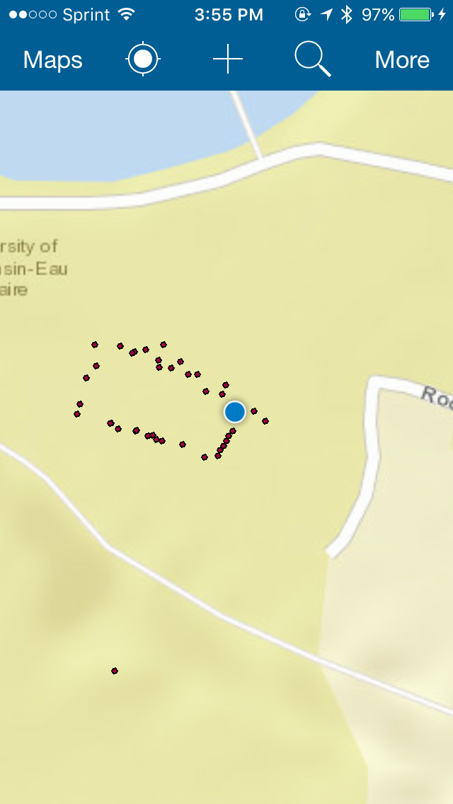
Figure 4. Map of all of the data points collected.

Results
The data I collected show a correlation between tree health and the quality of groundcover. Of my 40 trees surveyed, there were four that were surrounded by gravel. (Figure 5.) All of these trees showed illnesses including lichen, broken branches, and wounded limbs. This may also be because of it's close proximity to the parking meters. The healthiest trees, those showing no visible illness were those that were planted among communities that were well mulched, an had a large diversity of plants as groundcover. (Figure 6.)

Figure 5. The health of the trees surrounded by gravel (left) was severely less than trees that were mulched and surrounded by other species (right).
Figure 6. The ornamental trees that were both mulched an surrounded by a variety of species were in best health.
Aside from the trees most close to the Davies Center, and places within the visitor's line of sight, very few trees received any kind of treatment. Because I created the feature class before performing an initial survey, I was not sure how many of the data categories would be relevant.

Discussion
Things like taking time to set up a geodatabase, feature class and attributes are not what immediately comes to mind when you imagine the data collection process. Nonetheless it is arguably one of the most important aspects of data collection. A study is only as good as it's least accurate data so it stands to reason that it is also only as good as your data collection methods.

At the same time, too much specificity clutters up the data collection process, can cause inefficient issues an poses the increased risk of inaccurate data collection. Therefore there is always the need to know your subject well enough to create relevant fields with room for taking extra notes if needed.

 Creating a 'notes' field helps alleviate issues that arise due to nature, unusual occurrences, or criteria that you forgot in the initial setup. It is goo practice when you come upon a feature that cannot be accurately accounted to take notes on it, and return to the feature in post-processing for analysis. This is a more scientifically ethical method than simply skipping over a feature.

Conclusion
I found that the most important aspects of this exercise were sufficient preparation of collection methods and knowing the subject enough to know what data was essential and what was extraneous. I never knew that my personal phone was capable of data collection in this way and I am pleased to get a chance to find a new, potentially more efficient way to collect information.

Sunday, November 22, 2015

Create A Topographic Survey With A Dual-Frequency GPS and Total Survey Station

Introduction
The ultimate goal of the first topographic activity was to conduct a topographic survey with a dual-frequency GPS and a Total Survey Station. We were to learn how to set up and connect the equipment, and be able to troubleshoot issues as they arose. After collecting data we were compare the two survey methods, analyze the advantages and disadvantages of each, and be able to apply each to appropriate projects.

Study Area
The study area for this activity was the UWEC campus mall between the Davies Center and Schofield Hall (Figure 1.) The area can be found behind 105 Garfield Avenue, Eau Claire, WI 54702.
Figure 1. Google Earth image of the UWEC campus mall.

This location was chosen because it was a large enough area (1 hectare) for our survey criteria and had adequate microtopography change with which to create a significant survey. It's recent construction in 2013 meant that it may not yet have been adequately surveyed using this equipment for this exercise. The wide open space allowed us to obtain 100 topographic points without the need to create break lines which would complicate the project beyond the scope of this exercise.

Methods For Dual-Frequency GPS
This exercise and the following topographic exercise seemed to be a hard lesson in "buttonology," or the maddeningly specific series of actions one must take in order to work with the equipment. In class Prof. Hupy treated us to a demonstration for the Topcon Tesla.(Figure 2.) The Tesla connects to a Topcon Hiper which is the dual-frequency GPS which gives survey grade accuracy.(Figure 3.) The Hiper attaches to the top of a standard height tripod. The height is standard so the GPS can account for the distance to the ground. We also employed the use of a portable wifi hotspot called Mifi. (Figure 4.) This ensured that our connection would remain steady and stable. This also meant we could collect data in more remote locations without wifi. If we had used the campus-wide wifi, the signal would be unstable and could drop which would severely impact the data. It was important that we didn't "wander off" with the portable wifi after connection lest we lose our signal and corrupt our data.
Figure 2. Topcon Tesla similar to the one used in the exercise.
Figure 3. Hiper Dual Frequency GPS mounted on a tripod of known height.
Figure 4. Mifi portable hotspot.

 We then had a lecture outside where each of us set up our project, specified collection criteria, and practiced connecting and disconnecting the device safely. We were warned that an incorrect disconnect could cause a whole host of issues so we were very conscious of our disconnection method.

My partner Grant and myself were to collect 100 data points. We opened up the job that we had created in the class demonstration and set the Tesla to take 15 points at each spot. The Tesla would then average the locations of those points to select the final data point. This is to account for any minor movement or error that can occur with any handheld device. We chose 15 because we felt it was accurate enough for the purposes of this exercise, but time efficient enough to enable us to collect 100 final data points within an hour.

In order to obtain a point, we moved the tripod over a desired spot and used the attached bubble level and adjustable legs to obtain as precise of a level as we could. We followed a back and forth meandering pattern in order to achieve a microtopographically diverse dataset.

After we completed our survey, we exported the data from the Tesla in the lab. After opening our project file we exported the data as a text file using Exchange. (Figure 5.) We had to "clean up" the data by removing extraneous text from the top line in order to make it more useable and clear when importing it into ArcMap. (Figure 6.)
Figure 5. Grant exporting the data into a .txt file.
Figure 6. "Cleaned up" text file.
In ArcMap, we chose 'Add XY data'  and selected our X field to specify for the Easting, the Y field to specify for the Northing, and the Z field to specify for our height. (Figure 7.) Because of licensing issues we were in Demo mode and could therefore only collect 25 points at a time so we had to repeat these steps three more times to get all 100 of our points into ArcMap (Figure 8.)
Figure 7. Add XY Data window. Here we specified the X,Y,and Z fields to the Easting, Northing, and Height fields.
 
Figure 8. Map of data from the Dual-Frequency GPS survey. Because the data had to be broken into four different files, I wasn't able to create an elevation map for this section.

Methods For Total Survey Station
A similar technique was used for the Total Survey Station survey, however some more equipment was used. This included a Topcon Total Survey Station (Figure 9.), the associated tripod, and a survey prism.(Figure 10.)
Figure 9. Total Station similar to the one used in the exercise.
Figure 10. Prism similar to the one used in the exercise.

In the class demonstration we learned how to properly level the total station through increasingly precise adjustments. The data collection demonstration proved to be an issue even for Prof. Hupy as buttononlogy claimed even a seasoned expert. (Figure 11.)
Figure 11. Prof. Hupy expressing visible anguish as he experiences 'buttonology issues.'

In our own survey Nik, Scott and I got our station leveled fairly quickly and needed to employ the help of Prof. Hupy to get us started.(Figure 12.) The next step was to establish backsight points. These points were taken by Scott with the Hiper using the same technique as the Dual-Frequency GPS survey. (Figure 13.) As we learned in the distance azimuth survey exercise, once an accurate location of a point is known, we can then use them to orient another survey method, in this case our total station.
Figure 12. Scott and Nik setting up the total station.
Figure 13. Scott obtaining the backsight points.

Data points were collected by aiming the laser within the Total Station at a reflector within the prism mounted at a known height of two meters. The angle of the reflection and height of both the prism and the total station can then be used to generate highly accurate data points that can be used in a microtopographic analysis.

After connecting all of our equipment we were ready to take the survey points. Blessed with a steady hand and generally poor eyesight, I elected to hold to prism at various locations and elevations within the study area while Nik and Scott took turns aiming the laser housed within the total station and collected the data points. (Figure 14.)We collected points at a variety of elevations along Little Niagara because that area offered the steepest elevation gradient within the campus mall area and was where Scott had initially taken his dual-frequency data. The demo mode only allowed us to collect 25 points and with a heavy and unrelenting downpour adding to the geospatial fun, we collectively decided that enough data had been collected to achieve the purpose of the exercise. Data extraction to XY data followed the same process as above and resulted in the following map.(Figure 15.)

 
Figure 14. Nik getting ready to collect the datapoints using the total station.
.
Figure 15. Elevation map created from collected data.

Results/Discussion
Both of the survey methods produced highly accurate elevation data. Unfortunately due both to weather, time constraints, and equipment issues, I was not able to use both survey methods to survey the same area.

I found the dual-frequency GPS survey method quick and easy to setup. There was less equipment to worry about and this method could realistically be completed with only one person. The disadvantages of this method is that I questioned the accuracy because I don't believe that we were ensuring that each data point was perfectly level; especially when we started going a little faster in order to return the equipment at the required time. The tripod was a little cumbersome especially with a broken leg and needing to adjust the legs at every point became a bother. If you are by yourself and need to collect a limited number of points (0-500) I would recommend this survey method.

I found the total station setup complicated and confusing. At first I had a hard time understanding what the backsights were for but I eventually connected it to the distance azimuth survey concepts which made the concept more palatable. Leveling the total station was not as difficult as I had anticipated and once we got the total station working I found that data collection went especially quick, even more than the dual-frequency method. Although set up took longer and there was more equipment to account for, the accuracy for this method was better because it was not necessarily relying on human adjustment, and instead relied on the established parameters. A disadvantage of this method is that it can take a novice a long time to set up and it requires at least two people; one to hold the prism and the other to take the data measurement.

Generally, I found these survey methods initially complicated, but ultimately accurate. I am sure that an expert can produce great quantities of data at an incredibly fast pace but I am unfortunately not presently at that level. Perhaps with practice I can increase my setup efficiency. I am thankful that I could rely both on my group members, Martin, and Prof. Hupy when we got stuck.

Conclusion
This field exercise was a good introduction to the realm of 'real world survey methods.' Data setup is often overlooked in the bigger picture, but it is nonetheless vital to achieve proper accuracy. Knowing how to troubleshoot is also an ever improving skill that I personally am working on for all fieldwork. As always I am thankful that I can add this method to my field survey repertoire.

Sources
Google Earth, UWEC Campus
Hiper image from Bunce Industries LLC website
Mifi image from Softpedia SoftNews website
Topcon Tesla, Prism, and Total Station image from Topcon website


Sunday, November 1, 2015

Priory Navigation With Map and Compass


Introduction
This week was a continuation of the concepts of last week's exercise; using alternative non-technological navigation methods. One can never know if or when technology will fail, so it is essential to have many navigation methods in your repertoire. In this exercise we used the maps that we created in the previous week to aid us in navigating to various points in The Priory wilderness area.

Another purpose of this activity was to evaluate the effectiveness of the maps that we created last week. It is difficult to discern the usefulness of a map until one is in the field because the usefulness of a map greatly depends on field conditions which may not be able to be predicted. During this activity we found what information was extraneous, essential, and missing.

Study Area
The exercise took place in the wooded area behind The Priory. The Priory is an extension of the UWEC campus located approximately 3 miles south of the main campus and consists of 112 acres of wood and shrub land with deep ravines running through some areas.(Figure 1.) The building is a multipurpose institution featuring dormitories, child care, and Children's Nature Center.(Figure 2.)
Figure 1. Aerial image of the Priory area. Image taken from Google Earth

Figure 2. The Priory. Photo obtained from Priory Facebook page.
Woodland features of the priory whose importance became apparent during the activity was the decidedly steep ravines that crossed our study area multiple times. Some of the ravines still contained flowing water and access to and from the bottom was particularly treacherous. Tree growth was mostly hardwoods and undergrowth consisted of a high density of the invasive Common Buckthorn Rhamnus cathartica and Prickly Ash shrubs Zanthoxylum americanum. As our course was by the highway and some remote residential parcels, we also discovered large amounts of felled barbed wire fencing that more than one caught our knees and pant legs.

The temperature during the activity was mild for a late October day and while overcast, stayed reasonably light until after 6:00pm when we caught ourselves still within the woods.

Methods
After assembling at The Priory parking lot, Professor Hupy gave us a brief demonstration on how to use the compass with the map. By lining up the compass with two points on map and aligning the north arrow with the arrow on the map, you can see the bearing for the direction you will have to travel. We discussed the term "red in the shed" meaning that if you can place the magnetic arrow within the red arrow outline etched on the bottom of the compass, you can find what direction you need to go.(Figure 3.) The USGS website has a more detailed description on the steps to take when using a map and compass for navigation. Because metal and magnetic forces can disrupt the accuracy of the compass it was stressed that the compass should not be used on or around metal.

Figure 3. Compass used in the navigation activity.
Each group was handed a colored printout of the chosen map using the UTM coordinates, the chosen map using lat/long coordinates, a compass, and a sheet of paper with five geographic points that we were to find in the activity. (Figure 4.)

Figure 4. Maps given to us and the sheet with the navigation points.

We plotted these points on the map and found that we all plotted them slightly differently. This was a good thing because we were able to compare and take an average to where the point was likely to be found. I discovered that because there were very specific locations, using a ruler to hold my place made my point placement much more accurate. (Figure 5.)
Figure 5. Marking navigation points on the map using coordinates.

We then drew lines between the points and calculated the distance between them and the amount of paces each of us would have to take in order to reach the point. (Figure 6.)
Figure 6. Distance calculations.
Because each of us took a different amount of paces to reach the same distance, we each calculated the number or paces to all of the points using each of our pace rates. For example, for every 100 meters I walk 65 paces. The distance between one point was 280 meters which means that I would have to walk 185 paces to reach the point. (Figure 7.)
Figure 7. Map used for navigation activity. We calculated that Casey needed to walk 187 paces to reach the first point.


We also established roles which we often switched. One person would determine the bearing and direct the pacer to a particular landmark. The remaining group member would 'leapfrog' to the next landmark to ensure that the pacer was remaining on track and also served to 'stamp down' some of the brush that might impede the pacer. (Figure 8.)
Figure 8. As Casey paced, I went ahead to stamp down obstacles and ensure the direction landmark.


Results
As often happens in life, this activity did not go perfectly according to plan. The first obstacle was that even with a somewhat standard pace and good faith in out initial direction, it was very difficult to accommodate steep elevation gradients into our pace count. Subsequently, we fell very short of the first marker and in estimating where the first navigation point actually was, we mistook another course point as our first point.(Figure 9.)

Figure 9. The first incorrect point. Casey is using GPS to determine that our actual navigation point is quite a ways north.

 This affected our search for the next point as we were not correctly set up to find the navigation point from a false point. Unfortunately, after we determined our mistake, it occurred a second time. (Figure 10.)
Figure 10. Casey at the second misidentified point.
We resorted to using our GPS to find the first navigation point. After that, we were fairly successful in finding the navigation points, excepting when the flag was missing or fallen. For this, we had to use the GPS to reset our direction.

A major challenge of this activity was the terrain. Our area consisted of decidedly downwards ravines that we had to slide down, sometimes literally, and subsequently ascend. Thorns and barbed wire added to the fun. This was made especially difficult as we often had to 'search' for the point with the GPS which resulted in some backtracking up and down gullies.(Figure 11.)
Figure 11. Casey running down one of the more shallow gullies we had to cross.
 Light also became a factor towards the end of the activity. Late fall sunset was occurring as we found the first point and the group decided that didn't find navigating these woods in the dark particularly appealing. (Video Figure 12.)

Figure 12. Survival log.

Discussion
Although the execution on the concept was a little shaky due to multiple factors, the concept was very helpful during navigation. We found the maps useful although we all decided that it would have been beneficial to have the guidelines darker as they became hard to discern as light began fading. It also would have been beneficial to increase the resolution of the topographic lines and coordinate point grid lines. What appeared to be a relatively small area on the map turned out to be fairly large in the field. This is why it is important to test our maps in field conditions for applicability. This activity also solidified some of our necessary teamwork skills.(Figure 13.)
Figure 13. Scott cross-referencing map information with GPS.
 When things went wrong we had to rely on each other to come up with alternative navigation methods including distance azimuth and simply 'fanning out' to find a point. This also resulted in 'in-field group discussion' as we planned our next method and best courses of action. (Figure 14.)
Figure 14. Lively group discussion as we determined the less treacherous path.
The track log of the path we took can be found on Scott Nesbit's blog. The GPS we were given was accidentally turned off so we relied on his personal device.

Conclusion
This activity was a great hands on activity that taught us not only the concepts, but in-field applicability which I also find immensely more helpful in my understanding of the concepts. Although our group faced some more physical challenges and missed out on the 'debriefing period,' I'm still glad that I got to apply the concepts in a way that will be more likely used in my future career as a biologist. It also taught us a good lesson on what is, and what isn't necessary on a map. This will improve our cartography skills and prevent our maps from becoming too cluttered with extraneous information.

Sunday, October 25, 2015

Development of a Field Navigation Map and Learning Distance/Bearing Navigation

Introduction
Before the advent of modern geospatial technology, geographers used a wide range of methods to find their path and direction. Some of the earliest methods involved navigation by the stars in the sky(Figure 1.) or by the angle of the sun's rays. In this exercise we used another ancient method to determine angle and distance, pacing.
Figure 1. Example of navigation by stars and lunar position. Image by Tim Woods.

The Romans used a pacing method when marching through uncharted territory. Mile is formed from the root word 'mili' meaning 'thousand.' Mille passuum translated to 'one thousand paces' and was one of the first established units of long distance measurement. (Scotland Mountaineering Council)

From the distance data collected we can create maps that will aid us in Navigation at The Priory in the subsequent exercise.

Methods
For the start of this exercise we needed to measure our own walking pace as measured on a known distance. We determined two points with a 100 meter distance between them and walked using our normal walking pace to the end.(Figure 2.) We repeated the measurement on the way back and compared the results. I found that for every 100 meters I walk about 65 paces. Paces were defined as every time my right foot hit the pavement. In the subsequent navigation exercise I can determine that for every 100 meters I need to travel I will have to walk about 65 paces.
Figure 2. Measurement area for pacing. Just past the grey van is 100 meters.
We will use this measurement on the maps that we created for the subsequent navigation activity at The Priory, a multiple use UWEC facility.(Figure 3.)We constructed two maps to be used, one that utilizes a UTM grid with 50 meter spacing and one that provided Geographic Coordinates in Decimal Degrees.
Figure 3. Locator Map of The Priory in relation to the main UWEC campus.
In order to create our maps we utilized existing aerial satellite images, elevation data, and area boundaries from the general Geospatial Data folder. These features will help us distinguish minor changes in the vegetative cover and topography of the area when we perform the navigation activity. although sometimes helpful, a satellite image is not a good primary tool for navigation because vegetation changes seasonally and it is difficult to discern much detail from an aerial image on the ground. Elevation is a useful feature to some extent as it gives you an idea of what the ground topology should look like. I used a 5 foot elevation spacing because it looked to me to show an adequate amount of feature change while not cluttering up the map. Large changes in ground elevation can be useful for navigation because it gives us features to look for such as slopes or hills, but it can also hinder our navigation as it is difficult to perform standard walking paces up and down the area.

The most important aspect of our maps was projecting the right data and having known measurements and scales from which to begin our pacing. I opened the Layout View in ArcMap. I open up the data frame properties and clicked the grid tab. (Figure 4.)


Figure 4. Grid tab in the Data Frame Properties Window.

This gave me to option to create a new grid. All of the grids were set as Measured Grids because we wanted one that would divide the map into standard measured units. From the windows that result I could adjust the properties such as font, color, significant digits, and appropriate spacing. This also where I set the coordinate system for each map.  This part was the most difficult because it required both playing around with the features and then fine adjustment. I found that subjectivity was also involved. What I found to be a pleasing color and spacing may have seemed aesthetically unpleasing to another. The final step was to adjust the other features on the map such as scale bar, north arrow, title, legend, watermark and helpful data. Being able to compare the final UTM map (Figure 5). and the GCS Decimal Degree map (Figure 6.)will be helpful during the navigation exercise.
Figure 5. Final UTM map created for the navigation activity.
 
 
Figure 6. Final Decimal Degree map created for the navigation activity.

Discussion
Pace counting for distance measurement is a useful tool as it requires no equipment other than one's self. However, ground hazards such as brush, steep elevation changes and impassable areas might be a hindrance that newer technology will be able to overcome. Another issue is that there can be variation in paces for a variety of reasons including fatigue, miscounting, over or undercompensating, and needing to sidestep to avoid hazards. Regardless, I predict that this method will be beneficial to have in my repertoire in case of technology failure.

I am slightly apprehensive using the maps in the field. Although I often use maps for reference I tend to rely on landmarks instead of pacing to achieve distance measurements and orientation. It will be an interesting exercise and I hope to solidify my confidence in using this method. I believe comparing the two maps and using my team's combined skills will help me develop confidence in my own navigation skills.

Conclusion
It is vital to have multiple navigation methods available for use because one never knows what situation they will be presented. Knowing how to create a map for navigation use is also vital because not every area has the correct area or data for your use. It is useful to learn these things and these skills with be utilized in our future careers as geographers.

Sources
The Mountaineering Council of Scotland
The Greatest Idea Campaign Ever Run, Tim Woods
UWEC Resident Halls

Sunday, October 18, 2015

Unmaned Aerial Systems


Introduction
The purpose of this exercise was to experience a UAS, an Unmanned Aerial System. We were exposed to various UAVs (Unmanned Aerial Vehicles) and were lectured on their platform attributes along with their strengths and weaknesses in various situations. When choosing the proper UAV, a lot depends on the project at hand and it's constraints, be they flight time, stability, takeoff distance, ect.
This exercise contained three components. The first was a viewing of various vehicles and their attributes, a short lecture by Prof. Hupy about applying the right vehicle to the projects, and a flight demonstration on the Chippewa River floodplain. We flew the DJI Phantom and gathered aerial imagery of features on the floodplain. The second component of the exercise was taking the data collected from the DJI and creating a high pixel image interpretation using a point cloud with Pix4D software. This component focused on UAS related software so we also explored creating a flight plan with Mission Planner Software, and tested out our own UAS driving skills with Real Flight Simulator. The third component of the exercise was to apply our knowledge of UAS and select the most appropriate vehicle for a given scenario.


Methods

Part 1: Demonstration Flight
One of the most important aspects of UAS is having enough knowledge of UAV attributes in order to make the most efficient and cost-effective selection. Aerial systems can range from helicopters and drones, to fixed wings airplanes, and to kites, balloons, and satellites. For this exercise we focused on multirotor and fixed wing aircraft.

The first UAV we saw was a fixed wing aircraft composed mostly of styrofoam. (Figure 1.)The components included the "brains" of the craft; Pixahawk-3D robotics. This system was the flight control of the craft. The modem incorporated into the craft communicated with a computer on the ground or at a base station. It allows the craft to essentially fly itself, which differentiates it from RC or 'remote controlled' craft which are controlled by someone on the ground. Another component of the fixed wing was the antenna which served as a receiver, a battery which powered the craft, and a hook which is used with a bungee launcher to propel the craft to a high enough initial velocity to achieve flight. After the launch, the internal mechanisms take control over maintaining flight. Many UAVs can be outfitted with additional components in order to achieve the goals of the flight mission. This fixed wing aircraft contained a POM, or Personal Ozone Monitor. This device can be used to detect ozone levels a various altitudes and locations and attaches a GPS location with the data, which environmental scientists can map and analyze.
Figure 1. Internal mechanisms of styrofoam fixed wing aircraft. Note the antenna, modem, Personal Ozone Monitor and other flight components.
An advantage of this UAV is its long flight time of 1.5 hours. A longer flight time means more time to collect data for analysis. Another advantage is that a fixed wing provides for a stable flight due to its internal mechanisms and broad wings. (Figure 2.)This prevents data skewing due to craft pitch, haw, or roll. A disadvantage of this system is that it's batteries do not provide a lot of energy output as related to their weight which means that a large portion of energy is required to accommodate for the weight of the battery. Another issue is that the batteries are highly volatile and have been known to combust spectacularly when overheated. This of course provides a dangerous component, not only to the system itself, but also for bystanders and flammable study areas.
Figure 2. Broad wing of the fixed wing aircraft. The wings were detached for storage and transportation purposes.
The next UAV we observed was a Multirotor Quad Helicopter. (Figure 3.) The "quad" describes the four rotors. The rotors spin in opposite directions which is beneficial to efficient upward force. With the four wings an operator can control the rate of speed and how the craft steers.
Figure 3. Multirotor Quad Helicopter
A benefit of this craft is that it can be launched straight up which is beneficial in places with not a lot of launch space such as the deck of a boat. Another benefit is that because each rotor can be controlled independently, it is more agile than the fixed wing aircraft. A disadvantage is that like the fixed wing, there is not a lot of payload for the energy input required. More torque is needed, and is shown in the Multirotor with six total rotors (Figure 4.). This craft can handle wind better and has more energy output than the quad helicopter. Both of these crafts handle easier than the fixed wing, and can make tighter turns. However, both of thee crafts have a shorter flight time of less than ~35 minutes.
Figure 4. Multirotor Helicopter with 6 rotors.
After the UAV lecture we moved to the study area on the Chippewa River Floodplain. This area was chosen because it was relatively flat, had features we could easily map from an aerial view including rock features and the UWEC pedestrian bridge. It was also decently free of foot traffic and obstacles such as trees, buildings, and territorial birds of prey. Professor Hupy discussed the various safety methods and the startup procedure. (Figure 5) We then observed a flight and took aerial pictures using a stabilized camera. (Figure 6) I had the opportunity to fly the craft and found it not as easy as Professor Hupy made it seem. I am prone to crashing aircraft as shown in the subsequent flight simulator and was therefore hesitant to perform any drastic manuvers with the craft lest I cause a budget strain for the UWEC geography department.
Figure 5. Professor Hupy demonstrating proper safety and startup procedures.
 
Figure 6. Drone footage.

Part 2: Software
Another huge component of UAS is being able to convert the data into a usable format. For this we explored Pix4D, a software that uses cloud point mapping (Figure 7.) to convert images to maneuverable geographic data.(Figure 8.)
Figure 7. Feature shown using cloud point mapping.
Figure 8. Data imported into Pix4D for mapping
The processing took a long time so I went ahead and used the Real Flight Simulator in the other room for 45 minutes while the program ran in the lab. The first set of data was disrupted because although the progress bar said 100% completed, I didn't wait until I saw the success message (Figure 9.) and exported the file too soon which corrupted it and caused it to be useless.
Figure 9. Success message detailing the quality of the resulting feature.


I reran the process using only 12 images and found that the processing was much quicker. I then opened the resulting image in ArcMap and added background base mapping available from the previous lab. I found that the resulting map was very accurate and placed the image precisely where it occurred in the real world. (Figure 10.) (Figure 11.)

Figure 10. Ortho Map. Location of the resulting feature exactly where it occurs in the physical world.

Figure 11. DSM Map. Note that the river level changes but the feature is accurately displayed.


Another software we used was Flight Plan Mission Planner.(Figure 12.) This software allowed us to plan out theoretical missions and tweak factors to our imaginary constrictions such as flight time, altitude, and the amount of images we wanted to capture. I was surprised when tinkering with it to learn how many features were codependent on others. At some times these dependency's seemed almost counterintuitive until I reasoned through it. I explored and manipulated the effect of altitude, (Figure 13.) speed of the UAV (Figure 14.) and angle (15.)

Figure 12. Default values of Mission Planner software.


Figure 13. Manipulation of altitude.
I found that as altitude increased, the total amount of passes decreased. This is because more of the area will be included in the frame of the camera lens so fewer passes are needed. However, fewer images at a higher altitude will increase the level of distortion at the edges of each image. These distortions will need to be accounted for either in post processing or in additional flights.
Figure 14. Manipulation of the UAV speed.
The speed of the craft only had an effect on the total flight time of the project. It likely depends on camera speed but I would have thought that there would be a decrease in photo resolution or quality. Practicality issues that are not easily accounted for also arise such as what speed is physically capable for a particular UAV and potential danger to spectators and wildlife.
Figure 15. Manipulation of angle.
Angle was the final factor I manipulated. Because this project ran North to South, a change of angle only served to slow down the process as more time was spent flying over what wasn't included in the study area. This could be helpful in other project's whose orientation is not aligned with the cardinal directions.

In order to give us a better hands-on understanding of the differences between fixed wing and multirotor aircraft, we logged a half hour of flight time for each using Real Flight Simulator Software. This gave us the chance to 'play' with each platform and explore it's aspects without the danger of potentially costly damages and crashes.

The fixed wing system I simulated for 30 minutes was a Sea Plane model. (Figure 16.)
Figure 16. Sea Plane Scenario
I found that, as I expected, there was a major learning curve. My initial flight was decimated within fifteen seconds as I was feeling out how the controls worked. The next three or four flights ended the same way. However, after I discovered which controls did what, it became fairly intuitive although my total flight times remained short. I found that it was much easier to control the craft at high speeds, but if I made a mistake, it was much harder to correct. I found that the craft was fairly stable compared to the other simulations which I attribute to the broad wings and landing mechanisms. I admit that I chose the simulation and how I tried to land based off of an scene in the cartoon sitcom, Bob's Burgers. (Figure 17)

Towards the end of the simulation, I found I was able to successfully fly the craft upside down which was amusing but likely not practical in real world situations lest I become a stunt pilot. Overall I found the exercise very instructive and far less expensive than if I was to learn by myself. (Figure 18.)

Figure 18. End of the fixed wing aircraft simulation.
The second UAV I ran a simulation with was with a helicopter. (Figure 19.)
Figure 19. Beginning Helicopter simulation scenario.
I found this a far more difficult UAV to fly, perhaps because I could not have a 'chase' view and had to observe it from the ground, as one would do if they were actually controlling it. This made me less motion sick, but I found it much more difficult to determine my intended direction as compared to my actual direction and orientation. Start up was an issue because I struggled with the order of operation for flight. The pre-flight figure was helpful in determining the function of some of the controls. (Figure 20)
Figure 20. Startup controls that provide for a safe launch.
My flight times were far shorter because I resorted to simply 'hopping'; taking off and landing multiple times, slowly increasing my altitude until I felt mildly comfortable. I found the stability of the craft much harder to work with as very little steering caused the helicopter to veer off wildly. Steering was far less intuitive and there were very few soft landings. I found that durability was also a major issue as compared to the seaplane. I felt, rather resentfully towards the end of the simulation, that the helicopter would break if I simply looked at it wrong. (Figure 21.)
Figure 21. End of the Beginning Helicopter simulation.
Overall, I found the helicopter far less intuitive and much less forgiving to a novice operator. I enjoyed the stability and ease of operation of the sea plane, although the helicopter was faster and more precise in it's movements. I understand how each has its strengths and weaknesses as applied to a project.

Part 3. Scenario
A pineapple plantation has about 8000 acres, and they want you to give them an idea of where they have vegetation that is not healthy, as well as help them out with when might be a good time to harvest.

I would suggest implementing a plan using a lightweight fixed wing UAV. 8000 acres of cropland is a large area so a helicopter or quad copter would not be as efficient. Multirotors specialize in precision operations because they are agile and easy to steer over small areas to obtain precise details. Because of the broad nature of cropland, the long takeoff distance of a fixed wing UAV is not a negative factor.  A fixed wing UAV would be a good choice because it can fly for a longer period, on average 1.5 hours, it will have ample room to turn corners at the ends of the field, and the photos it will obtain will be taken in a more stable manner. I would suggest that the fixed wing UAV be outfitted with a camera that can collect an NDVI, or Normalized Difference Vegetation Index. This will help them see differences in crop health easier than with normal satellite photos and the images will have a higher resolution because the area is focused.

Conclusion:
This exercise was an important exposure to UAS and their platforms. Much of geography is trending towards the new possibilities that UAS offers and I believe that this technology will become increasingly relevant. It was exciting to control a UAV and participate in data collection. Data processing, which is often overlooked compared to the flashier 'drone' aspects, is also extremely important and I'm glad that I was able to process some data. It was also very useful to simulate both a fixed wing aircraft and helicopter in a way that causes no danger to anyone.